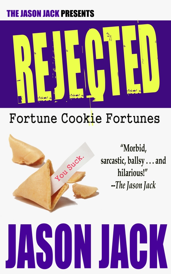
Hello, readers! Today, I want to tell you about the creative process and evolution behind the cover for my newest, hilarious book, REJECTED Fortune Cookie Fortunes! Here's the final cover for all those wondering.
Now, let's go back to the beginning.
The idea for this book was to create hundreds of fortunes that you normally would not see in "real life". Simple. The purpose of a cover is to market and communicate that idea to everyone else. And it doesn't hurt if the cover looks good, either.
In my experience, all good covers
- 1. Will look good in thumbnail form. This is how most readers will see the cover online.
- 2. Must look good in black and white. This is to make sure your title and name contrasts the background on black and white digital devices (think Nook and Kindle).
- 3. Have to have flow/good composition of elements/complementary color scheme. This is the artistic merit part. The cover just has to look "good".
With that said, let's look at some of the rejected covers for REJECTED Fortune Cookie Fortunes!
COVER ATTEMPT #1
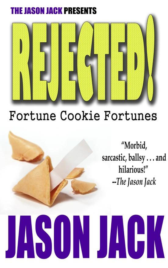
Straight off the bat (on my first attempt), I had rule number 1 and 2 locked down. My name and the title would be easily legible in thumbnail form and in black and white because the large font titles would contrast the white background. I chose yellow because I connoted the color with fortune cookies and purple happened to be yellow's complementary color.
The font for everything except the title looked professional, and the placement of the font and fortune cookie were legit. But, that title font had to go. Also, capitalized REJECTED looked better than REJECTED! with an exclamation point. See for yourself.
COVER ATTEMPT #2

I did away with the texture on the title, moved the font around to make the overall cover eye-appealing, and added a purple banner behind REJECTED.
The banner was the missing link, that extra something to make the cover pop and equal out the purple of the lower half with the top half. The title font, however, still wasn't clicking with me . . .
COVER ATTEMPT #3
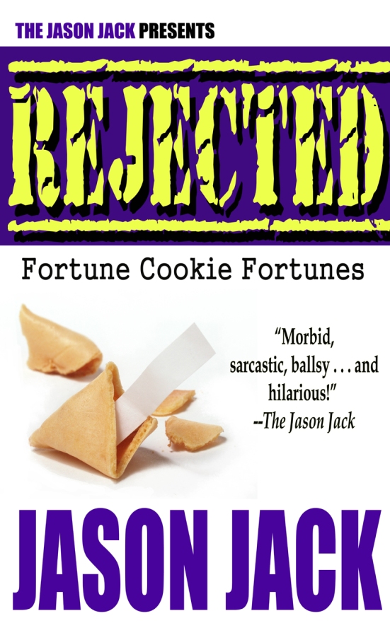
Enough said about this one.
COVER ATTEMPT #4

My sweet Misses rotated the title when I went to the bathroom. She was on to something. I tried many different fonts (that didn't work, including the one on this attempt) until I stumbled upon something better.
COVER ATTEMPT #5

This near finished cover has the finalized font, but one thing was missing: an example of a rejected fortune, something the reader could easily understand. So, I decided to add "You suck" to the paper sticking out of the cookie. I also changed the background to an off-white color for printing reasons.
FINAL COVER
Tada! Cover finished. Oh, wait let's do the black and white check . . .

And now we're done :)
I hoped you enjoyed today's post. And I hope you all understand how much goes into creating a near perfect cover. From the best font choice to colors, contrast to composition, it's hard work :) But worth it. Well, what do you think?
***
REJECTED Fortune Cookie Fortunes
Synopsis:
"Told from the hilarious and often times pessimistic perspective of a disgruntled paper fortune, REJECTED Fortune Cookie Fortunes is a no-holds-barred tome of hilarious bad advice (mis-fortunes you'll never see from the cookies at your local Chinese restaurant) that will make you laugh out loud!"
!LIMITED TIME OFFER! SEE DETAILS BELOW!

To celebrate the release of my new, *hilarious* book, REJECTED Fortune Cookie Fortunes, you can purchase a digital copy from SMASHWORDS.COM at 50% off! And you can do this in three simple steps!
1. Create a Smashwords.com account.
2. Go to REJECTED Fortune Cookie Fortune’s product page and add to cart.
3. At checkout enter “PF28G” (not case sensitive) into the coupon field!
2. Go to REJECTED Fortune Cookie Fortune’s product page and add to cart.
3. At checkout enter “PF28G” (not case sensitive) into the coupon field!
REJECTED Fortune Cookie Fortunes is a tome of fortunes too morbid, sarcastic, ballsy, and hilarious for your regular fortune cookie to handle!
PRODUCT PAGE LINK: Click Here!

No comments:
Post a Comment